Want someone to buy your product? Or donate to your cause, contact you, or read more about your work? In all these cases, you’ll need a strong call to action (CTA) on your website—one that people just can’t resist clicking.
In this post, we’ll give a brief introduction to good website CTAs. We’ll talk about some of the different types, what makes a good CTA, and how you can experiment on your website to find the kind that works for you.
What is a CTA on a website?
A CTA (call-to-action) is a button, image, icon, or line of text that prompts you to click and do something. The best CTAs are short, to the point, and encourage visitors to take an action on your website. Like “Sign Up” or “Buy Now.”
But a CTA doesn’t have to be super salesy or pushy. Think of it as a clear, helpful road sign leading to the next step of the customer journey.

Does your website need a call to action?
Yes! Whether you sell products, offer services, want visitors to contact you, or just read more about you—you need a clear CTA to direct them Have you ever visited a new site and thought, “Ok, great….What am I supposed to do now?”
When this happens, most of us will hit the back button and try a different website. Few visitors are going to hang around and guess what they’re supposed to do next. That’s why every website can benefit from a clear call to action, even if it’s a simple button like “Learn More.”
First, decide what you want the CTA to do
To figure out what kind of CTA you want, where it should go, and what it should say, first answer one question: “What do I want people who visit my website to do?”
There might be a few things on your list, but focus on your number-one priority. That’s what your main CTA should be.
- If it’s a portfolio website, you want them to look at your work.
- If it’s an online store, you want them to buy your products.
- If it’s a coaching or consulting website, you want them to book an appointment or get in touch with you.
- If you’re a musician, you want them to listen to your music or find out your next show.
Whatever your main goal is, your CTA should help you achieve it.
Examples of call to action phrases
Now that you know what you want visitors to do, let’s choose the best CTA. Here are some basic categories:
Traditional CTAs
No need to reinvent the wheel here. These are simple, to the point, and they work:
- Sign Up
- Donate
- Join Now
- Get Started
- Learn More
Personal CTAs
A more personal CTA puts your work front and center and shows that you’re proud of it:
- My Work
- What We Do
- Talk to Us
- Our Philosophy
Salesy CTAs
These kinds of CTAs work for businesses that are trying to connect quickly with readers and create a sense of excitement and urgency. But they’re not for everyone:
- Yes I Want ____!
- Score ___ Now!
- Do You Want ___?
CTAs for discounts and scarcity
You can use CTAs to create a sense of urgency or fear of missing out. For example, to encourage customers to take up a limited time offer or promote another discount strategy:
- Get Today’s Discount
- Activate 15% Off
- Claim Your Free Sample
CTAs for different audiences
If your website has different audiences, you might provide two separate CTAs that lead to different places. For example, you might have some content that’s aimed at new visitors and some for people who already know you:
- For Kids / For Parents
- I’m New Here / I’m a Returning Customer
- Continue in English / Continue in Spanish
- Shop All / Shop Bestsellers
CTAs that emphasize free or easy
A good CTA will help customers overcome common hesitations—typically that something costs too much, takes too much time, or will be annoying or difficult:
- No-Risk Free Trial
- Set Up in 5 Minutes
- Try it Free
Non-traditional CTAs
Got a fun, irreverent brand voice? Then a quirky CTA can work. Just make sure your target audience will be able to figure it out, and will enjoy the process. If someone’s just trying to get in touch with you and you’re making them press funny buttons, they’ll go elsewhere:
- Prepare to Launch
- Buckle Your Seatbelt
- I Want This!
What makes a good call to action?
There’s a lot of conventional wisdom that successful CTAs should use active language, like “Start Your Trial” or “Build Your Kit.” You want people to take charge and feel empowered and positive. You’re putting them in control.
That’s good advice, but not right for everyone. If you offer a service that people feel unsure about, a more low key CTA could help them take the first step.
For example, if you’re a therapist or a financial advisor, maybe your target audience has been hesitant about getting in touch. A CTA that’s more inviting like “Let’s Talk” or “See How We Can Help” could work better than an active CTA like “Call Us!” or “Take Charge!”
Think about the difference between a button that says “Do It” vs. “Let’s Do It.” The first is more active, for sure, but depending on the circumstances, the second might feel less scary and help build trust in your website.
How to add a call to action button to your Jimdo website
On Jimdo websites, there are a few different ways to add a call to action button.

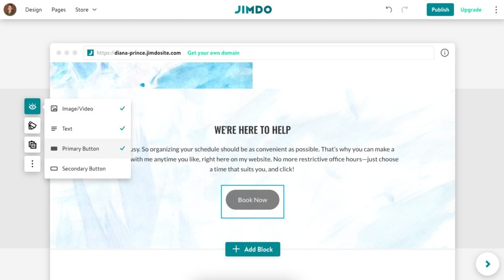
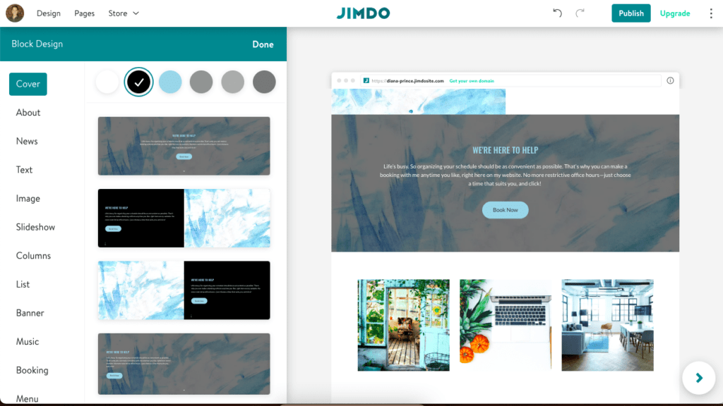
- Browse through the Block Menu and you’ll see different options, including Cover Blocks, About Blocks, Columns Blocks, etc. (Note: If you’re a Jimdo Creator user, you’ll use the Button Element).
- Once you choose a block, you can hide or show a CTA button by choosing Show elements from the left menu and clicking the check mark next to Primary Button or Secondary Button.
- You can also add a call to action button to your website navigation menu, or to a top banner using a News Block.
- Once you’ve added the button, just click it to change the text. Then choose where you want the button to go. You can choose another page of your website, a phone number of email address, a booking service, etc.
- To change the design or shape of your buttons, open the Design menu. The style of the buttons will depend on the Color Theme you’ve chosen, as well as the background color. It’s designed to make it easy for each button to show up clearly, with a size, font, and color that’s easy for people to see.

Of course a button isn’t the only kind of call to action. Find out more about how to use icons or pictures as a CTA in our post How to Find and Use Free Website Icons and How to Edit Photos without Photoshop.
What color is best for call to action buttons on a website?
This is one of the most common questions about CTAs, but there’s no magic color that will always get people to click.
Whatever color you go with, it should be easy to see against your website background and fit with your product and branding.
For example, if you’re offering spa treatments, bright orange might not go with the relaxing vibe you’re aiming for. If you’re selling something fun and exciting like river rafting tours, a bright color with CTA text like “Bring it On” or “Let’s Go!” could look great.
Note: With Jimdo, your primary and secondary buttons will be part of your website’s Color Theme. This means that they will stand out, but still complement your overall web design. In Jimdo Creator, you can customize the color of your Button Elements using the Style Editor.
Easy upgrades to your website CTAs
Lots of large companies A/B test their calls to action, meaning they try different types and track what works best. You can do a version on your own website. Try a few of these CTA ideas and see if any increase your conversion (you can track these in your Website Statistics).
- Try changing “your” to “my”: “Book Your Appointment” vs. “Book My Appointment.”
- Try a CTA at the top banner.
- Be more transparent. Instead of saying “Contact Us” you could try saying “Contact Us, it only takes 5 minutes” or “We’ll call you back today” – letting people know what to expect can take away some hesitation.
- Try experimenting with active language (eg.Build, Start, Discover) vs. passive language (eg. Get, See, Find Out).
- Try using social proof, something like “Join the hundreds of people who have already discovered X.”
Checklist: How to make a good call to action button
With all the theories out there, deciding on the best CTA can get a little confusing. But these basic rules of thumb will help you make sure your CTAs are working well:
- Are they easy to see against your website background? Do they stand out?
- Are they easy to click on, or tap from mobile?
- Is it clear where the button will take you?
- Are you offering only one or two choices?
More than that can lead to decision paralysis.
- Is your CTA placed “above the fold” (at the top of the page) so people don’t have to scroll down to get to it?
- Is the text of the button short and simple, 2-5 words?
- Have you cleared away clutter around your button, so there’s nothing distracting from it?
On the plus side, having your own website means you can try different CTA phrases and ideas whenever you want. With a little experimentation, you can see what works best for your business and your audience!

