When it comes to a custom website, most people initially think of great pictures, inspiring texts, and a color scheme that perfectly complements your brand design. Fonts rarely come to mind. But the right font is just as much part of your brand personality as those other elements.
To make your search for the right Jimdo font easier, we’ve put together an extensive list of font combinations for you. Read this article to discover how to find the perfect choice for your website and why fonts are so important.
Fonts make an impression
The font you use for your texts should be a conscious choice. Because similarly to your image choice and your color palette, your font affects the first impression your visitors get when they visit your website.
Therefore, when selecting your fonts, we recommend paying attention to three things:
- Readability. What’s most important is that your visitors can read your texts. Avoid fancy fonts that are hard to decipher. Opt for fonts that are legible on all screen sizes.
- Style. Everyone has their own style, even your business. Ask yourself: is your brand more of a playful, creative type, or is it more down to earth? Depending on that, choose fonts that best convey your brand personality.
- Width. The width of the individual letters varies from font to font. That means that texts in some fonts look a different length to texts in other fonts. That can make a huge difference, especially when it comes to headings. Look for a font that doesn’t take up too much space. However, it also shouldn’t appear too squashed. Aim for the perfect balance.
What font types are there?
There are many ways to categorize fonts. To avoid it getting too complicated, we want to limit ourselves to a rough classification into three different categories: serif, sans serif, and decorative fonts.
Serif fonts
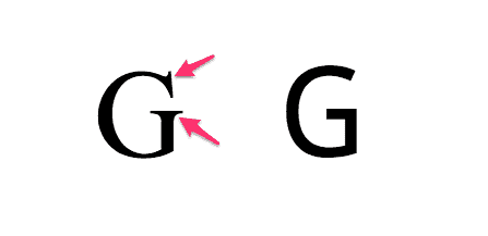
The serif roots reach back to Greek and Roman antiquity when words were still being chiseled into stone. Because it wasn’t so easy, small extensions developed at the endpoints of the letters while chiseling—at least, that’s one of the most common theories.
Over time, these extensions became regular features of the letters, even when the hammer and chisel were no longer used for writing. Nowadays, you’ll find serif fonts in books, newspapers, magazines, and other printed materials. The reason being: serif fonts supposedly make it easier to read printed lines.

The most famous serif fonts include Times New Roman, Garamond, and Baskerville, for example.
Sans serif fonts
When the first computer screens appeared, it quickly became apparent that serif fonts were almost impossible to recognize and display due to the low resolution. So designers developed several fonts that displayed crisp and clear despite the low pixel count. They completely did away with serifs and other decorative elements.
Some of the most common sans serif fonts are Arial, Lato, and Verdana, for example.
Decorative fonts
In this broadly diversified category, we’re placing ornate lettering, cursive, and other design fonts together. These fonts offer plenty of variety and personality but aren’t always that legible.
Decorative fonts are more suited to short texts or groups of words—such as headings or your company logo. For longer paragraphs, fonts from the other two categories are the better option.
The psychology of fonts
Just like colors, fonts can also conjure up certain feelings and reactions. Because even if it is just about letters, we subconsciously associate them with various impressions and experiences.
We instantly notice if the statement and the font don’t match. Imagine a funeral home using Comic Sans in their advertising. I’m sure you’d think twice about entrusting these undertakers with Aunt Amalia’s remains.

Or how about a design agency that specializes in children’s books, but uses a font like Libre Baskerville?

A playful font such as Londrina Sketch would be a much better choice here.

Unlike colors, there are no detailed instructions or extensive studies as to which font conjures up which emotions and for whom. Finding the “right” font is, therefore, more about gut feeling than about science. If a font gives you bad vibes, then look for a different one.
Jimdo has the perfect font combination for you
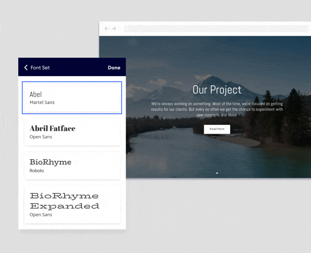
To make sure your website is always looking its best, our designers have combined a large selection of various fonts with each other. Each combination consists of two Jimdo fonts that are the perfect match for each other: one for headings and one for the body text.
When you select a font combination, it only takes a few clicks to apply it to your entire website. Then all of your pages will look consistent and professional, and you don’t have to go to the effort of changing them all manually.
To change your fonts, simply click on design in the menu on the left, and then on font set. Now you can click through all the combinations and instantly see how they’d look on your website.

Consistent font sizes for your website
To help you keep your font sizes under control, Jimdo allows you to set a uniform size for your whole website—simply choose from small, normal, medium, or large. The font sizes automatically adapt to your visitors’ screen sizes, so that headlines and body text are always ideally proportioned.
To change your font size, click on design in the menu on the left, and then on font set. Now you can use the slider to select the size you want for your website.
Deciding which fonts to use for your website shouldn’t be taken lightly. The right font is just as much part of the visual identity of your business as your logo design and company colors.
Spend some time scrolling through our Jimdo fonts until you find the combination that really suits you. Because a good font also leaves a good impression.

