Earlier this week we talked about how to write for your website so that people will want to read it. But what about the way your text actually appears on the page?
Words aside, text is yet another visual element on your website, just like your images, colors, and template.
And just like those other visual elements, text needs to be arranged and styled in a way that makes it clear and accessible to people who visit your website. For website text, your mantra should be “readability, readability, readability.”
Focus on text readability
“Readability” is basically a measure of how easy it is for people to recognize words, sentences, and paragraphs. Considering how quickly people glance at your website, readability becomes a crucial factor in how long they will spend on your page and whether they will even attempt to read what you have to say.
Reading on screens is tough. Different studies have found that people read slower, less accurately, and remember less of what they read when it’s presented on a screen. By some estimates, website visitors only read about 25% of the text on your site.
Any obstacle to readability—text that is too small, a font color that’s hard to read, or irregular line lengths—will lower that percentage even more.
So the more you can do to keep your text readable, the happier your visitors will be and the more likely they’ll want to stick around a while.
How do you design text that will catch—and hold—readers’ eyes? Here are some factors to look at:
1. Line length
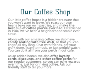
We may have grown up reading from 8.5 x 11 sheets of paper, but when it comes to on-screen reading, line length needs to be much shorter. With long lines of text, people’s eyes have to move side-to-side to take in all the words. It’s harder to skim, and harder to keep your place as you move from one line down to the next. Just compare these two websites, with the same text and font (16 pt Noto Sans):
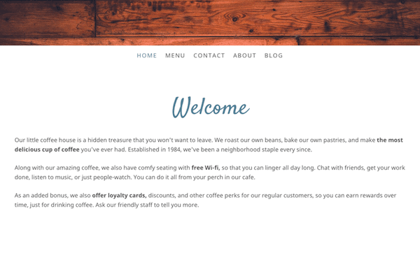
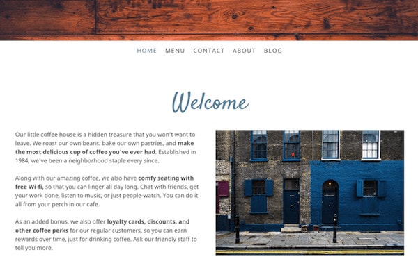
In the first example, the line length is 140 characters. In the second example, I added a Columns element and put the text on one side and the photo on another. This shortens the line length to 67 characters.
Readers see a longer line of text as more of an investment to read, so they are more likely to skip over it. The same amount of text on shorter lines looks more digestible and inviting.
For basic landing page text, there are lots of estimates for proper line length, but most fall somewhere in between 40-70 characters long, depending on the font size you are using.
With blogs, the lines can be longer because people dive deeper into the content. For example, the line length of this blog is about 115 characters. To figure out the length of your own lines of text, copy and paste it into a tool like lettercount.com.
Note: Many Jimdo Creator templates have full-width content areas (like template Zurich in the example above), which make them ideal for showing large images or photo galleries. When it comes to landing page text, though, it’s best not to let your lines run across the entire width. Try using Columns elements and Photo elements to break up the text and create shorter lines.
2. Contrast
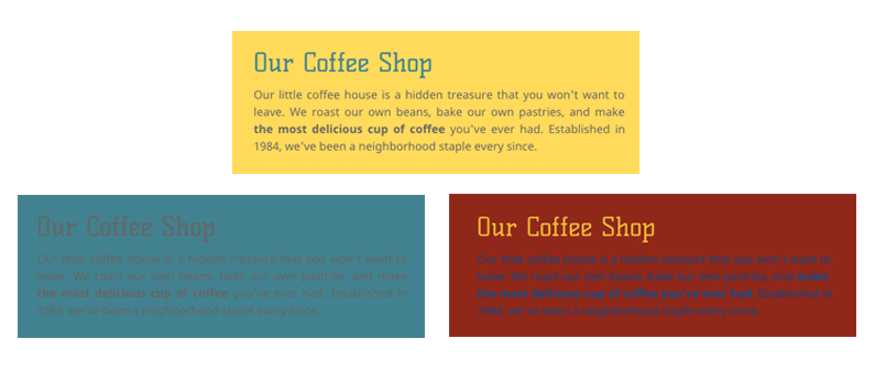
The better the color contrast between the background and the text, the better the readability.
For your website, make sure there’s enough difference between your background color and your text color so that the text is crystal clear. Even very different colors can clash badly when put together (like the red and blue example, below).
Choosing the right colors
With Jimdo’s Style Editor, the sky is really the limit when it comes to choosing colors for your fonts and backgrounds. Just make sure that you don’t sacrifice readability for creativity. There’s a reason books have been printed since time immemorial with black ink on white paper. If black and white seem too unexciting, you can always try gray, navy, brown, or another dark color.
Light text on dark backgrounds
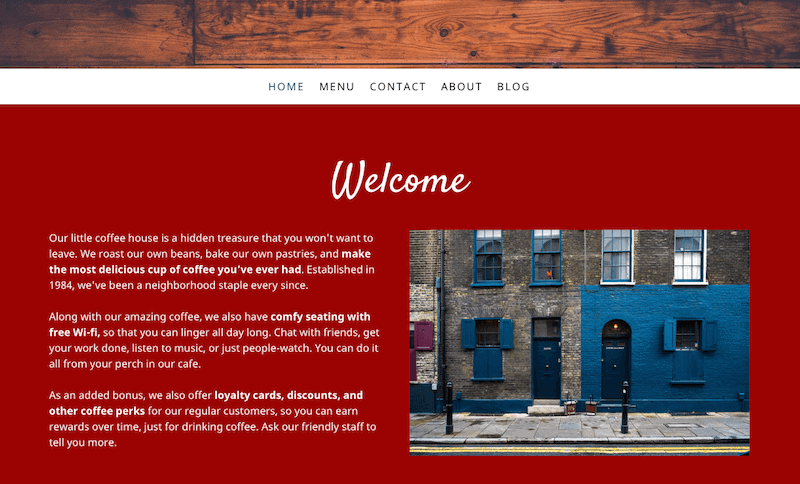
You can go the other way and choose a dark background with light text, but this is best used in small doses. Even with sufficient contrast, this combination can be tiring on the eyes if you have a lot of text to read. If you’re going this route, you need to make the font larger to get the same readability of a dark font on a light background.
Link colors
You can also adjust the color of your links using the Style Editor. Choose a color that complements your text but that will still stand out so people can recognize a link when they see it.
Not sure about your color combinations? It always helps to get a second opinion. If you use Jimdo’s Style Editor to choose a color scheme, it’s a safe bet that you’ll start with a color combination that works well. You can also use online web accessibility tools that measure the contrast for you and tell you if you’re in an acceptable range.
3. White space
On your website, there’s no need to crowd. Give your text a comfortable amount of “white space” (empty space) around it and it will be much easier to read and scan.
Think about it—if you open up a webpage and just see a big block of text, you’ll probably not even bother to read any of it. But if you see text broken up into smaller, more manageable pieces, you’ll probably give it a glance at least.
Add space and break up paragraphs
To create more white space on your site, try using the Spacing element and the Horizontal Line element to add more cushioning between Text elements.
You can also break up text into smaller paragraphs, or add bulleted/numbered lists.
Adjust your line height
Use the Style Editor in Jimdo Creator to increase the line height of your body text (this adjusts the amount of white space between lines of text). There’s no one rule for what your line height should be—you’ll need to adjust it based on the what looks best with the font and font size you’re using.

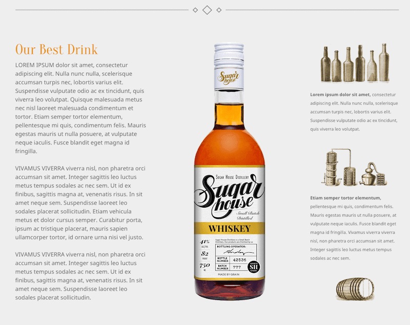
In the example website below, both the images and the text have a nice amount of empty space around them. This creates a sense of harmony and visual hierarchy (you know what to look at and read first). Notice how the designer has increased the line height in the text on the right hand side, which makes the smaller font easier to read.
4. Alignment and rough edges
In Text elements, you’ll see that you have the option of making text aligned left, right, center, or justified.
Choose the correct alignment
Left aligned text is pretty much the gold standard. Steer clear of center- or right-alignment for body text. While centered text can work well for titles and headings, it’s tough to read more than a few lines of it. That’s because the starting place of each line of text changes with every line, meaning that readers have to search to find the beginning of each line.

Justifying your text can make for very neat, uniform paragraphs. But depending on your text, sometimes the words can appear stretched or unnatural-looking.
Neaten up your right edge
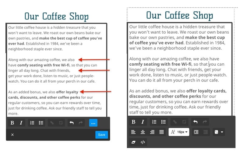
If you’ve been adjusting the styles and fonts sizes of a Text element, you may find that even if it’s left-aligned, the right hand side has gotten a little ragged. Normally this happens because the text was copied and pasted and contains “hard returns” or tabs in the text that you can’t actually see. If this is happening to you, you can fix it manually by deleting those extra spaces:
Note: If you’re copying and pasting text into your text elements and it all looks different, you will need to remove the formatting.
5. Font size
If you have really good eyesight, take a moment to pat yourself on the back, and then immediately go and check the font sizes on your website. Something that looks totally normal to you could have many readers squinting and scratching their heads.
A typical rule of thumb you’ll see on the web is to keep your body text at least 16pt. That’s a good place to start, but keep in mind that that number is entirely dependent on what font you’re using.
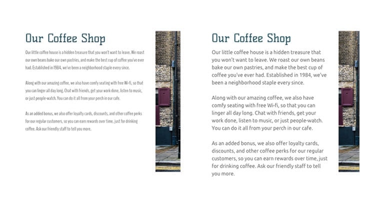
As the examples above show, there’s no substitute for looking carefully at your own text and judging for yourself. Better yet, get a few friends to help you with some user testing.
Bring your business online with Jimdo.
6. Font Style
With over 600 Google Web Fonts to choose from, how do you choose the right kind of font? Here’s a basic recipe:
- Headings: choose a stylized “fun” font. Since headings are large, short, and used sparingly, you can get away with a font that’s a little harder to read, but that adds visual interest.
- Paragraph/Body Text: choose a plain vanilla sans serif font. These are designed to be read on a screen so they will provide a smooth, easy reading experience in paragraphs and at smaller sizes. Good options are Open Sans, Roboto, Ubuntu, Lato, and Noto Sans (the font used in these examples).
- Navigation Menu: You can use one of your first two fonts here, or choose a third that complements the other two. Navigation menus have to be easy to read, so choose something with personality, but steer clear of cursive or decorative fonts.
Steer clear of all capital letters if you are writing more than a few words. Capital letters are great for navigation bars and short headings but are difficult to read in sentences.
Check out our blog post on Google web fonts for more recommendations.
Conclusion: your readability checklist
You put a lot of thought into your website text—and once you’re done writing the content, the next step is to make sure you’re presenting it in the clearest way possible. To review, here’s a checklist of readability factors to consider as you build out your website:
- Line length: Use columns and images to keep your lines of text on your landing pages to fewer than 70 characters long. Blog post text can be somewhat longer.
- Contrast: Make sure there is enough difference between your background and text color.
- White space: Use it! Short paragraphs, bulleted lists, and Spacing elements are a good place to start.
- Alignment: Use left aligned text and take the time to neaten up the right hand edge of your paragraphs.
- Font size: Not all fonts are sized the same, so even if you’re using 16pt for your paragraph text, it could still be too small. Check with someone who doesn’t have 20/20 vision to make sure it’s comfortable to read.
- Font style: When in doubt, use a Sans Serif font for your paragraph text. They are designed to work well on-screen. If you don’t want to use black, try navy, brown, gray, or another dark color.
Follow these tips and you can create appealing, inviting, and easy-to-read website in no time, which will let your actual message shine through.

