What do the most successful DIY websites do that others don’t? With millions of websites, we here at Jimdo have studied just that. Again and again, it’s a few simple tips that help make the most of your do it yourself website builder, no matter what your website is about.
Here’s a simple list of the best DIY website tips to get you started:
1. Start with a simple site plan
Grab a piece of paper and map out the pages you want in your main navigation menu. List any other subpages and where they’ll go. This will help you stay organized and show you the pieces of content you need before you start building. Check out this post for more details on building a site plan.
Learn how to start your own website today!
2. Keep your navigation menu short
Related to the site plan, you want to make sure your DIY website doesn’t have too many options in the menu. A menu bar that overflows onto two lines or has a lot of submenus is confusing and hard to use. A good rule of thumb is to have no more than 5-7 pages in your top navigation menu. Your website will look more streamlined and your customers will have an easier time finding what they need—a win/win. Here are 5 tips for a good website navigation menu.
3. Think about your audience
If you know specifically who you are trying to reach, you can create a website that’s targeted to what they need. Defining who your website is for (and not for) will make it easier to create a focused, successful do it yourself website. And remember, your audience probably isn’t “everyone”—that goal would be too broad.
4. Make your own logo
A logo is an important piece of branding for your DIY website. It helps make your business recognizable, and it’s something you can use on your social media profiles, product packaging, and print materials too. Use Jimdo’s Logo Creator to make one yourself, and put it right in your website’s logo area.
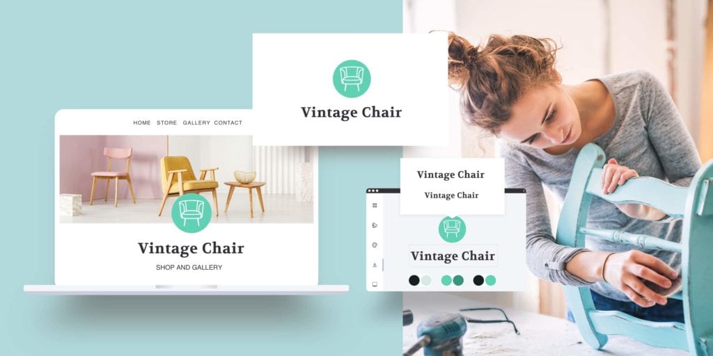
5. Use a logo with a transparent background.
While we’re talking logos, it’s best to use a version with a transparent background (typically a .PNG file). That way you won’t have a box or shadow showing up behind it. Here’s an explainer about the differences between image files.


Design a logo that makes your business stand out.
6. Invest in your own website domain name
Most DIY website builders offer a free version. But when you opt for a paid plan, you get a custom domain and no ads or logos will appear on your site—and these both signal to your visitors that you take your website (and business) seriously. Here’s more on how to choose the right domain.
7. Leave enough time to connect your domain
If you’re registering a domain through Jimdo’s website builder, the process is very quick. But if you’re trying to transfer your domain to Jimdo from another registrar, make sure you leave enough time—the process can take a few hours or a few days depending on your registrar.
8. Review some of the common website lingo
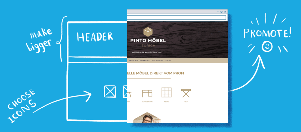
DIY website builders make the job easy, but it’s a good idea to familiarize yourself with some of the common website buzzwords you’ll hear about during the process (like CMS, HTTPS, UX…). Once you know what the terms and acronyms mean, you’ll see that they’re not so mysterious after all.
9. Check how your website looks on a mobile phone
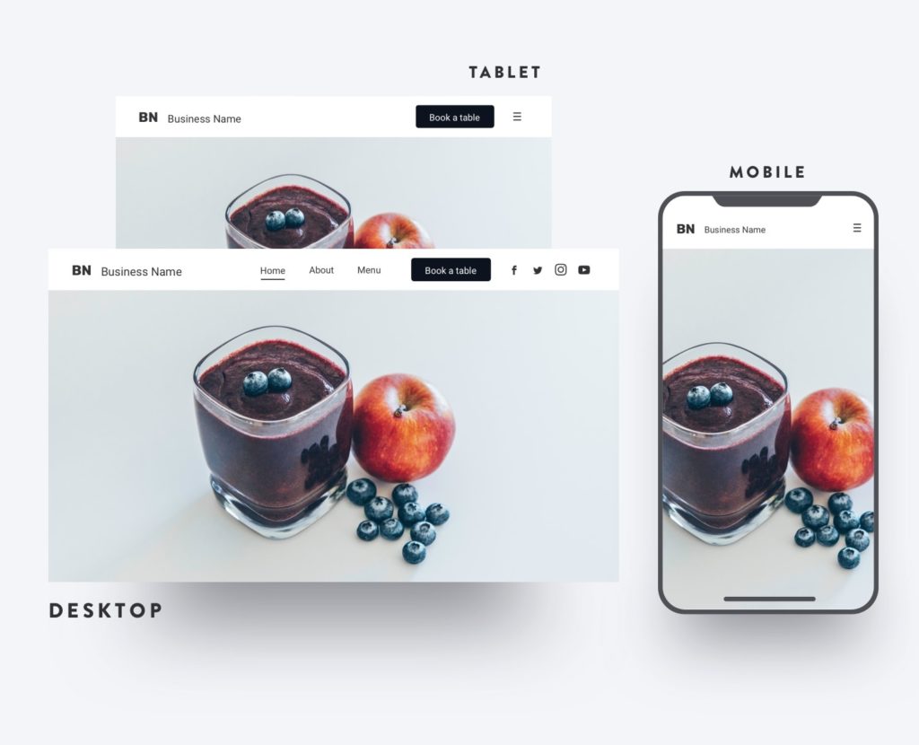
At Jimdo, all website templates are mobile responsive, meaning that they’ll automatically adjust to fit the size of the screen someone is using. Even so, it’s a good idea to double-check using View Mode to see how your site would look on a mobile phone or tablet—and also to make sure your font is large enough so that everyone can comfortably read it.
10. Use some DIY website design shortcuts
It’s easy to get hung up on the “yourself” part of do it yourself website building—but there are actually a ton of free resources out there that can help you design your website. For example, did you know that you don’t need to take your own photographs? Or that you can find free website icons for every symbol under the sun? Or edit your pictures without Photoshop? Read on for more design tips for DIY websites.
11. Use high-quality photos, even if they are stock photos
Stretching a low-quality photo into a large background image is tempting, but it’s not going to look very good. If your photos look grainy, pixelated, or blurry, this means they are not high-quality enough for the size you’re aiming for. Instead, check out some of the free resources for high-quality, professional photographs that you can use instead. We also have some good tips for optimizing the images on your website.
12. Choose simple website colors in your design
If you’re a beginner designer, it’s a good idea to keep your colors simple. Many of the best DIY websites find the right “look” with a simple black, white, and/or grey color scheme, and then they add small bits of color for variety. These colors might match your existing logo or brand colors, or be something that our website builder suggests for you in your color options menu. This classic website design approach is tried-and-true and always looks great. Read more about the best color combinations for DIY websites here.

13. Choose a font that’s very easy to read
Decorative fonts can be a lot of fun, but they don’t always translate well on a screen. Make sure you use a clear, screen-friendly font that’s good for websites and make it large enough for all visitors to read comfortably. Also be careful with grey text, as it can look too faint for people to see. When in doubt, black text on a white background on a do it yourself website is always a good idea.
14. Use white space in your DIY website design
Instead of cramming lots of content into a web page, it’s much better to give each part some breathing room, in the form of some empty “white” space around it. Designers know that websites with a good amount of white space are much easier for people to read and navigate. The lack of clutter is inviting, and it helps people prioritize what to look at.

15. Break up your text into small pieces
You start your DIY website, and you’re finally free to write exactly what you want, for however long you want. Just remember that reading on a screen is hard for people, and they’ll likely be skimming anyway. Break up your text into short paragraphs. Use columns, headings, bullets, FAQs, and white space (see above) to make your words easier for people to process. Here are other tips to make your website text look good.
16. Fill in your SEO settings
Lots of people skip this step because they think search engine optimization is too advanced for them, but that’s not true! Don’t be afraid to look under the hood of your DIY website and fill in your Site Title and keywords. You’d be surprised how many people leave these blank. And also take a moment to read our SEO Basics Guide. Once you know the general concepts, the process for improving your search engine ranking is much much easier.
17. Start tracking your website traffic, even if it’s low
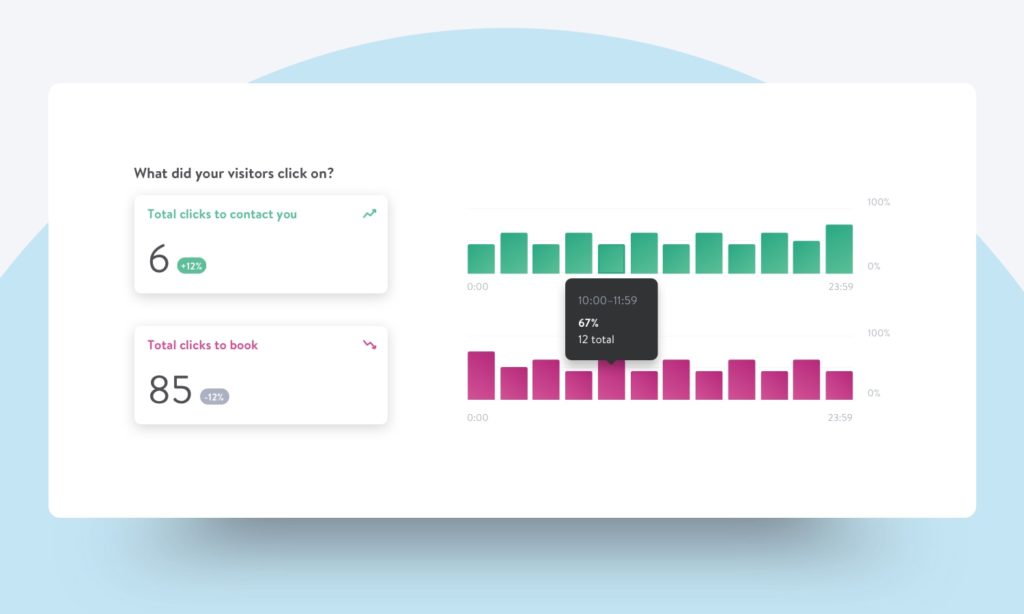
Even if you don’t get a lot of traffic right away (and that’s ok) you should turn your website statistics “on”. That way you can see your progress over time and watch your traffic grow. You’ll also learn more about where your visitors come from so that you can optimize your online marketing in the future. You can also connect your Jimdo DIY website to a Google Analytics account for even more detail.
18. Remember that good DIY website traffic takes time—be patient!
Once you publish your do it yourself website, you might expect to get traffic right away. Just remember that building website visitors takes time. First you can make sure that your site is easy for Google to notice. You can also write your website text specifically to be easier for Google to understand, and do some basic keyword research. Don’t fall for gimmicks or quick fixes to increase your website traffic—they probably won’t pay off in the long run. The best way to get the right website visitors is to make sure you have good content and optimize it over time, then track the results.
19. Learn more about your website’s legal requirements
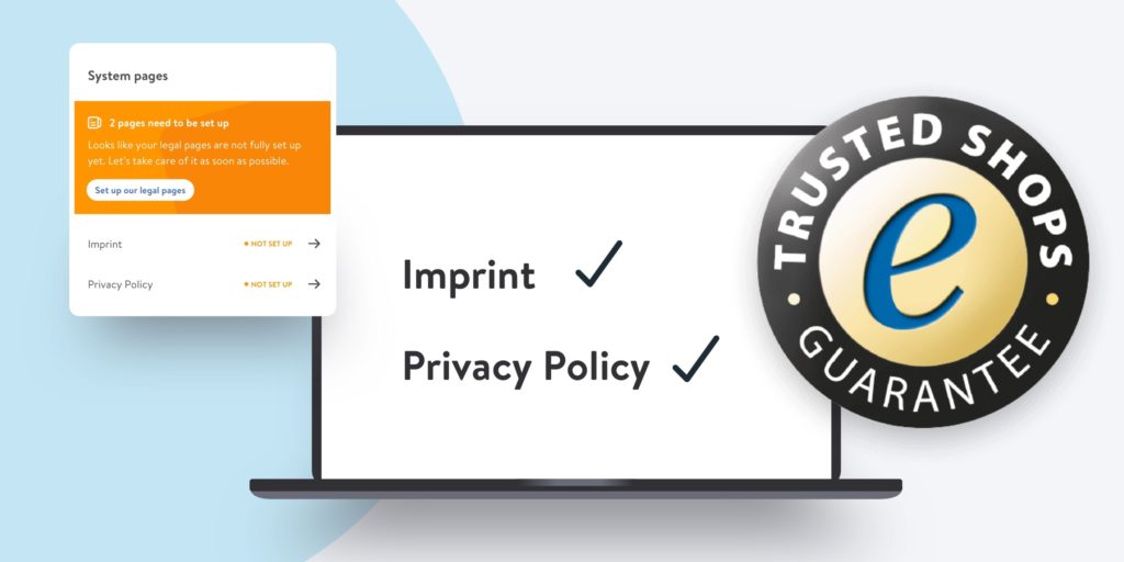
If you have a website based in the European Union or have customers in the EU, you should familiarize yourself with the General Data Protection Regulation (GDPR) rules. This is a privacy and data protection law relevant for many websites, including DIY websites. Though we always recommend consulting a legal expert, here’s a GDPR explainer to get you started. Jimdo also has a Legal Text Generator for EU customers that takes care of your website’s legal pages, like your Privacy Policy and Imprint, automatically.
20. Don’t worry about your DIY website being “done”
The truth is, a website is never really finished. There is always information to add, improvements to make, and new experiments to run. If you’re nervous about sharing your website with a wide audience, try to think of it as a work-in-progress that you can easily change over time. After all, the only way to make it better is to get out there and see how people are using it.
21. If you get stuck, know where to get help
Entrepreneurs are naturally a DIY kind of crowd, but don’t be frustrated if you need some extra help. Our Support Team is standing by and has experience with every kind of website, and we also have teams of Jimdo Experts who can give you specialized one-on-one help.
22. Get ideas from other successful DIY websites
You’re not alone! Check out our Jimdo Examples page to see more awesome do it yourself websites that our customers have built. Keep track of what you like, because chances are you can do something similar on your own website. We also have some tips on free ways to analyze your website competitors.


