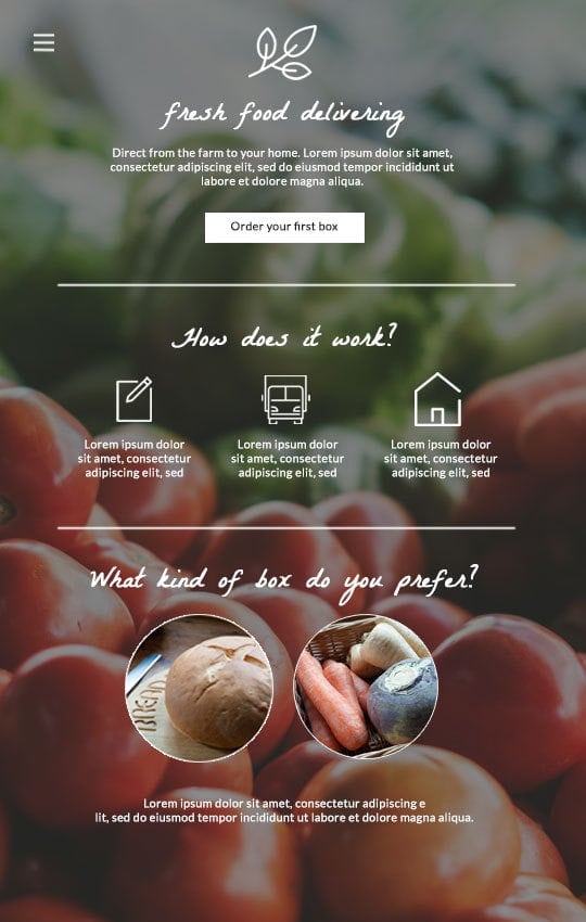
Jimdo users are an adventurous bunch. As early adopters of web design trends, you’re probably well acquainted with one-page websites. And it’s easy to see why everyone is smitten with this popular new kid on the block.
One-page websites offer a fast and clear reading experience, intuitive scrolling, mobile friendliness, and a sleek design. In a world where users are constantly bombarded with too much content, people love the simplicity of one-page websites.
One-page websites are an excellent option for many different types of websites but they’re not a perfect, one-size-fits-all solution.
Is a one page website right for you?
Before you create a one-page website, make sure it’s the best option for your project or business. Here are some tips on how to decide if a one-page website is right for you.
When to choose a one-page website
One page websites are a fantastic choice if you don’t have a ton of content or if your content is closely related, for example:
- Personal websites or online portfolio
- Small business websites that sells only a few products or a service
- Campaign-specific landing page
- Freelancer or resume page
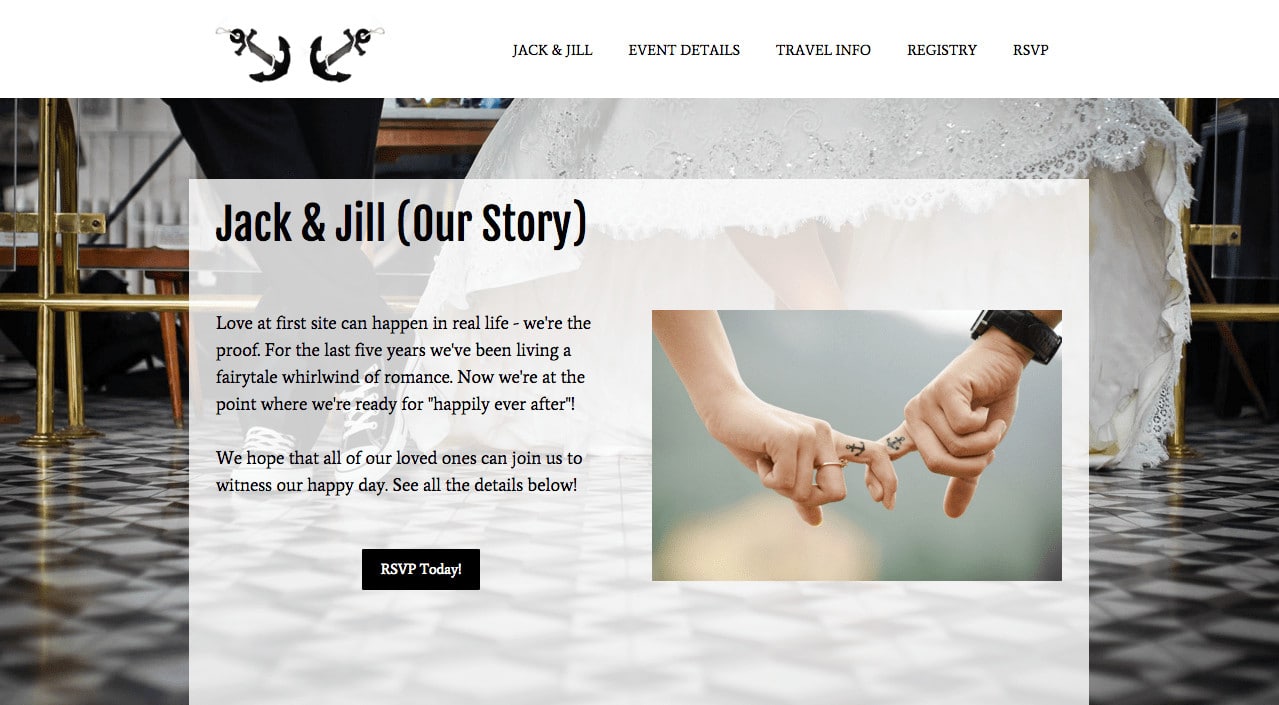
- One time events (such as weddings and conferences)
When not to choose a one-page website
If your website is content heavy, complex, or has tons of information, a one-page website isn’t a good choice.
How to create a one-page website
You’ve decided a one-page website is perfect for your website needs. Now what? Let’s learn about the best templates for one-page websites and 5 tips for designing a beautiful one.

5 tips for designing a beautiful one-page website
1. Keep it simple
Presentation is key to creating a successful one-page website. The most important thing to remember is that less is more. Before you create your site, think about your main message. Then make sure your text is easy to read and your content is short and to the point.
When visitors arrive at your website, they want to find essential information right away. Visitors shouldn’t waste any time finding your contact information or About summary. In order to do this, prioritize and remove any extraneous information. An easy way to do this is to think about how your audience reads and processes information. What essential information will they be looking for? Does your key content answer the 5 W’s: Who, What, Why, When, and Where.
We know that more than half of web visitors spend fewer than 15 seconds on a site. Why not give yourself 15 seconds to skim through your website. Was the essential information easy to find? Was your message clear? Are you interested in staying on the site to read more?
2. Set up a logical layout
We live in an instant society. To create an effortless reading experience, plan and conceptualize how you want to structure your content. Make each piece of content count by dividing your content into logical sections so users can easily find what they’re looking for.
One way to structure your website like a professional is to follow the cone principle. Important information should be at the top of your website, like what your website is all about. Then, gradually drill down to the more specific, supporting information. For example, say you’re creating a wedding website. The most important information—who is getting married and when and where is the ceremony taking place—should be at the top of your website. The less important information, such as the registry, is at the bottom of the page.

How can you check your website has a logical layout? Ask a friend or family member to ‘test’ your website.
3. Strengthen your story with multimedia
Did you know that 65% of us are visual learners? As visual creatures, one of the best ways to get your story across is through visual content. No matter how brilliant your text is, if you don’t break up long text with multimedia, readers will quickly lose interest. Enrich your text with photos, videos, and slideshows to captivate and inform your readers.
- Images: Beautiful images are an essential part of creating a stunning one-page website. Invest in some eye-catching, high-quality photos and you’ll be sure to make the perfect first impression on readers. Striking images set the mood, reflect your brand, and make readers more inclined to stay on your website. Learn how to take awesome professional product photos. Struggling to find good photos? Check out some of our favorite resources for royalty-free stock images.
- Video: Viewers spend 100% more time on website with videos, and it’s a good way to make your content more engaging.
- Slideshows: Looking for a visually striking way to display your multiple images? Slideshows are the perfect way to keep your readers engaged by featuring multiple images.
4. Create an easy-to-use navigation
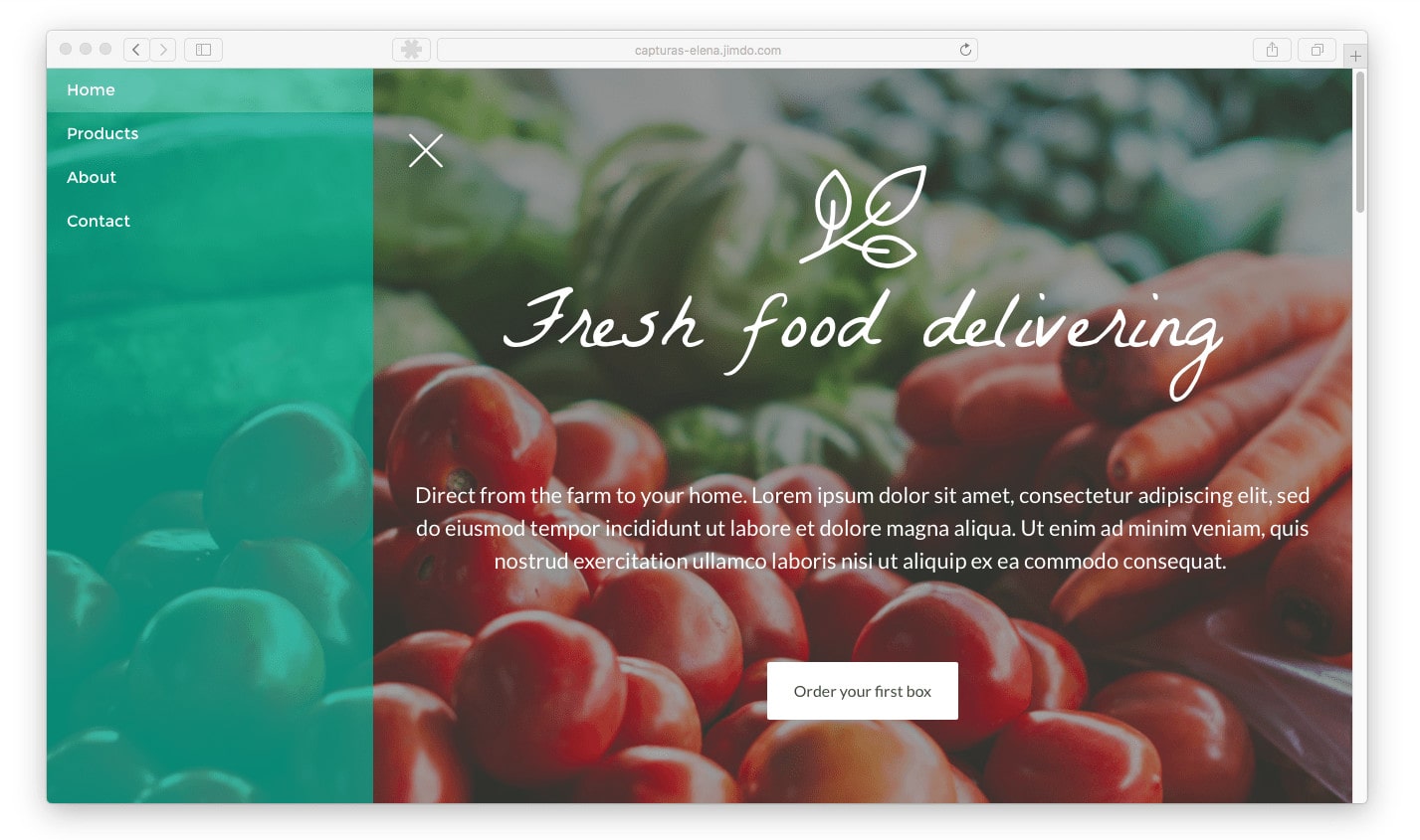
Even though users can simply scroll through your site, you still need to have a navigation to keep your website user-friendly. Navigation steers people to where they can find specific information about your product or service. Instead of taking your visitors to other pages of your website, you can set your Navigation to jump to different points on the same website by using anchor links.


Jimdo Creator users can add anchor links directly to the standard built-in navigation of their websites. To do this, select the external link option and type in the name of your anchor like this: /#about. This will allow you to turn any Jimdo template into a one-page website.
With a one page website, it’s important to keep your navigation simple. See a trend here? Think again about those 5 W’s and what navigation links are essential to create a clear website. Don’t redirect your audience to external websites in your navigation. It’s too confusing and they might assume it’s a wrong link. If you do need to redirect users to external sites, use icons to let users know where they’re being redirected to.
Bring your business online with Jimdo.
5. Develop strong calls to action
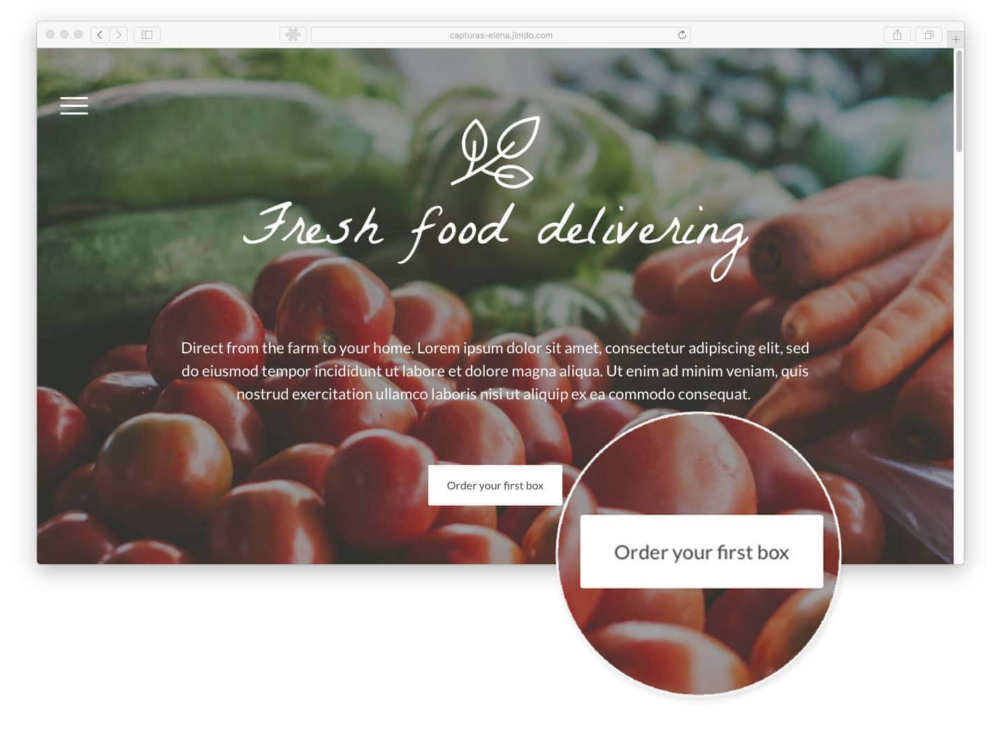
We often talk about how important it is to design your homepage with strong call-to-actions, so that your visitors know exactly where to go next. One page websites are no exception.
Think about all those times you’ve signed up for things online. Have you ever signed up for a newsletter? Downloaded iTunes or Dropbox? All of these ‘sign ups’ came about because the website created a persuasive call to action. Think about what you want you reader to do and how you can prompt them to take that action with an effective call to action.

