You want to develop your own logo. It should look good. And it should make you look good. Right?
There’s actually more to it. Your business is more than just any pretty logo. You are on a mission, you bring your own personality, and you have your own style of doing business. All of that combined makes you stand out.
And the things that make you stand out should make your logo stand out. So there can be no doubt that this logo represents your business. This logo development post will show you step-by-step how to think about your business’s style and get started choosing the right look.
Your logo carries the unique style of your company
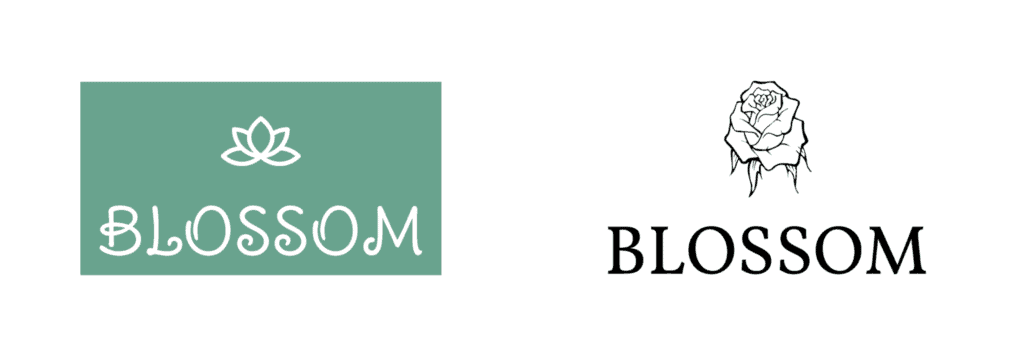
Take a look at these two logos. They are both logos for flower stores. But the styles set very different expectations. You might expect a more modern bouquet from the company on the left, and a more traditional one from the company on the right.
If you are reading this article, there is a good chance you have already started collecting some logo ideas. You may have collected logos from companies you like, found a shape or a color set that appeals to you. Good!
Now look at why you like them. You may notice all the logos you collected have soft flowing lines and pastel color tones. What does that say about the companies they represent? Probably a feeling of warmth, friendliness and calm. Is that the feeling you want to give your customers?
It might be perfect for a life coach, but less fitting for more formal professions.
How does your style fit your industry?
Did you collect logos from others in your industry? If not, it’s time to have a look at them. And not just any business in your industry. Look at your direct competitors. Your logo might show up next to theirs in search results or business lists. How do you want people to see you in that comparison?
Let’s go through some examples, all of them made with Jimdo’s free Logo Creator. Here are three sets of logos for various industries. Imagine for a moment that these are your competitors.
Example 1: Construction
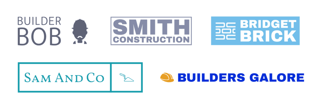
In this industry most of the logos are quite similar. They all use blue and gray tones. Most have some construction-themed icon. They all use plain, non-decorated fonts.
Now you can go two ways:
- Fit in: “Apparently this works. So I will do the same.”
- Stand out: “This style doesn’t express my business, so I will choose a different style.”
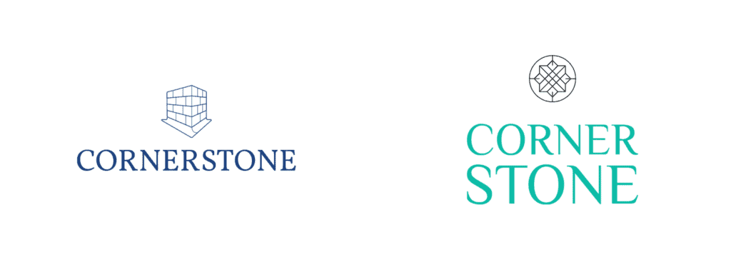
I can’t tell you which of these is better for your business. But you can. You know how you want to run your business and how you want to compare to your competition.
Do you want to conform to the existing standards in your industry?
Or do you want to disrupt your industry?
If you are unsure how to position your business, read our guide on branding for small businesses.
Example 2: Yoga studios
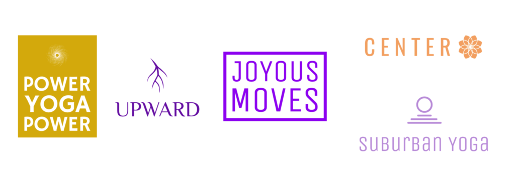
Another industry, more varied this time. You’ll recognize the color scheme is similar for all these logos. But the layouts and icons are very different.
In these examples there is no clear style to conform to. You have total freedom!
Of course, more freedom also means you have less guidance. This is why it’s so important to know your own style. If all options are open, a clear sense of your own style helps you make the right choices.
In this industry colors are a way to stand out or fit in. Differences in icon, fonts or company names will not make you disrupt the industry: there is so much variation already.

Example 3: Cafes

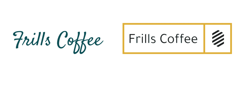
For this last industry you’ll notice there is variation in each part of the logos. Colors, icons, fonts, names, these logos are as varied as the cafes they represent.
You can base the choices for your logo completely on how you want people to perceive your business.
How to represent your unique selling point in your logo?
You have probably heard the term before: your unique selling point, aka USP.
The thing that makes you stand out from the competition.
The thing that makes people choose your business over others.
It doesn’t matter if you choose to fit in or stand out: you will still need to know why you are a better choice than the competitor down the road.
Wouldn’t it be nice if that unique selling point shines through in your logo development?
Tip: Your business name is a key part of your logo and brand. For help choosing a name, check out our post How to Name Your Business.
Let’s say your bakery uses regional ingredients only. How can your logo represent that?
- Your icon can show those ingredients or the farmer growing those crops.
- Your color set can be based on your ingredients, like a wheaty yellow.
- Your font can have a simple, straightforward look that comes across as honest, with nothing hidden.

If you are an accountant helping people clear their debts, your USP might be your discretion. Your customers want someone trustworthy and professional.
- Expressing that in an icon puts you at risk of being too literal or illustrating a cheesy metaphor. But not every logo needs an icon. You can go without for a no nonsense look.
- As a color blue or gray would fit well, as these colors are associated with calm and professionalism.
- Working in debt relief you offer people to bring clarity back to their lives. We want the logo to make you look approachable. So we choose a clean, professional font.

Develop a unique logo style based on your business
- Collect logos you like
Collect logos with shapes, colors or styles that might be right for your business.
- Compare logos in your industry
Look for patterns in the icons, colors and font styles they use. Pay special attention to logos of your direct competitors.
- Decide your position in your industry
Do you want to stand out by being different or do you want to follow proven best practices in your industry?
- Write down your USP’s
Make the unique selling points for your business clear and specific.
- Choose an icon, font and colors for your logo
Use your favorite logos, positioning and USP’s to select fitting components for your logo.
Making your own logo – a walkthrough
We’ll now follow the journey of three separate logos for fictional businesses.
- Stewy – Stewy is a food truck. The owner wants to offer a healthy, old-fashioned food option in an industry that is overrun by hipster burgers. Stewy offers various kinds of warming stews.
- The Powers That Bend – offers online yoga courses for busy office workers. Courses are fast, effective and aimed at keeping muscles lean. This business wants to break with the idea of yoga as a spiritual practice only.
- Ingrained – A woodworking studio where each product emphasizes the natural patterns in the wood. No two products are the same, because no two pieces of wood are the same.
In this walkthrough we’ll use Jimdo’s Logo Creator.
Design a logo that makes your business stand out.
1. Name
We’ll start by entering the business names in the Logo Creator. That’s a simple step.
Do take a moment to consider the legal entity of your business. Most business do not incorporate that in their logo development. But, if you work in a protected profession, it might make sense to show it.
The same goes for titles like Dr., M.D., or Ing.: if your industry values those, consider using your title in your logo.
2. Industry
If you want to go with industry standards, pick your industry or topic on the next screen. We’ll serve you up with a really good starting point.
If you feel a bit more disruptive with your business, go rogue. Pick construction as the industry for your flower shop. Or accountancy for your nail salon.
For our example business we chose these industries:
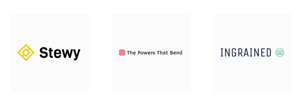
- Stewy – Food
- The powers that bend – real estate
- Ingrained – DIY & Renovation
The Logo Creator now serves up starting logos for our businesses. We will refine them in the next steps.
3. Set icon
Now we get to adjust our starting logos. Other than the name, the icon stands out most, so we’ll start there.
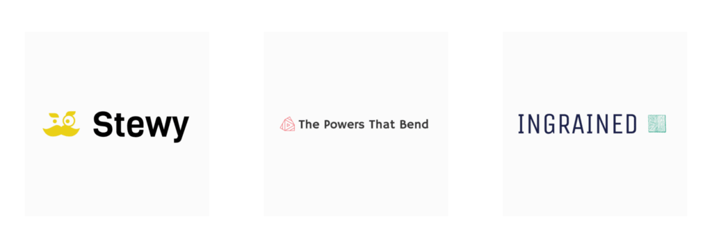
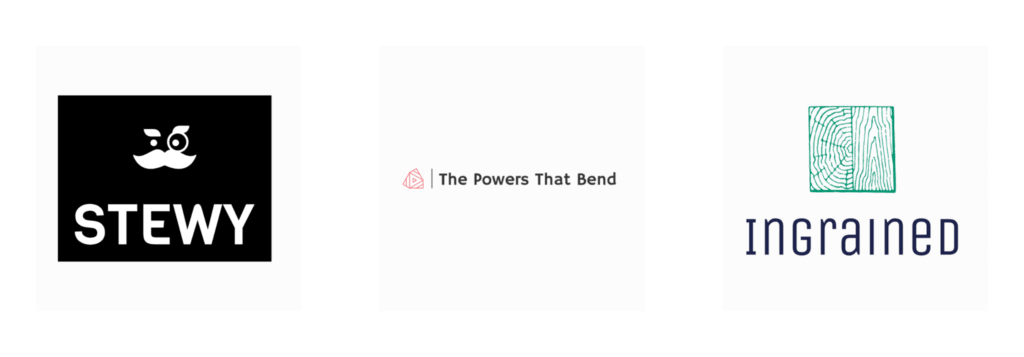
The owner of food truck Stewy wants to stand out and not be literal. So showing a bowl of stew is not an option. But the name already sounds like a character. As an icon we’ll look for a character that could be the mascot in this logo, our ‘Stewy’. The mascot should have an old-fashioned look to match the product.
Yoga studio The Powers That Bend wants to look different from other yoga studios. They want to stand out by addressing office workers. Where most yoga studios choose soft, curved lines or nature inspired icons, let’s go for something a bit more stylized.
For woodworking company Ingrained the unique selling point is the pattern in the wood they use. This might be one of the rare cases where being literal could actually lead to an eye-catching logo. Showing a wood grain means showing the product.
There are a ton of icons to choose from. All the icons in the Logo Creator are free for you to use, and when you download the set of files, it will include the icon alone so that you can use it as a website favicon and in your social media profiles.
4. Set the layout
You have an icon and a text. Do you want to show both of those? And where should they go? Different layouts put these components in different places.
For most companies this comes down to personal taste. What layout gives an aesthetic combination that fits your business style? But if businesses in your industry have very similar layouts, it comes back to either following that style or deliberately doing something different.
Stewy offers napkins with their food. So their logo should show up clearly on their white napkin. We choose a layout with a colored background, where the character is quite prominent. It gives customers something to look at while they eat.
For the clean, calm logo of The Powers That Bend we stick with the understated look. The icon gets the same height as the text. Next to the long business name the small icon becomes more of a decorative element.
For Ingrained it’s all about that icon. The wood grain is not only a unique selling point, it also combines with the business name. So the layout needs to make that wood grain icon clearly visible and eye catching.
5. Set your font
Fonts don’t get the credit they deserve. The right font adds so much flavor to a logo!
Like colors different fonts can evoke different feelings in the reader. And that’s exactly what our logos should achieve. The font confirms the overall look and feel of the logo.
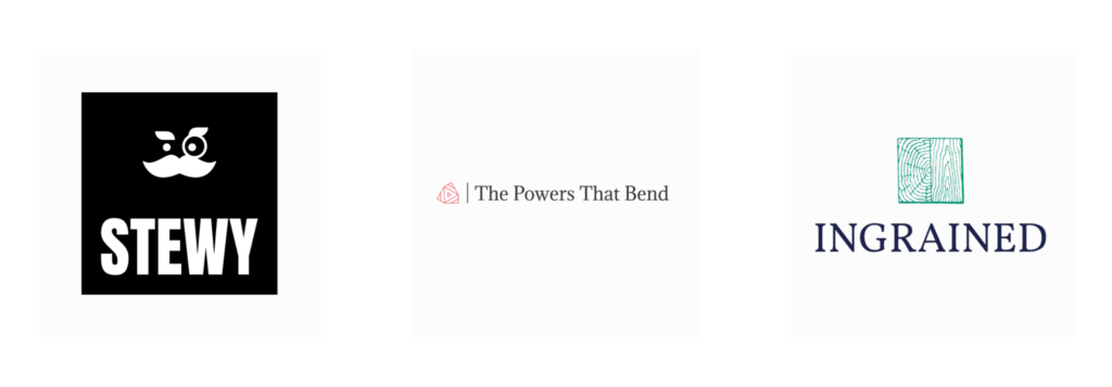
For Stewy we want to go bold and clean. The short business name must be easy to read in busy festivals with loads of distraction.
The Powers That Bend is a long name and the logo needs a calm business look. So we can not go overboard with the font. We choose a somewhat formal font with a serif.
Ingrained has a lot of warmth and personally in their logo. The many lines in the icon make the logo quite complex, so a simple, easy to read font can compensate for that.
If you plan to use handwritten or decorative font for your logo, remember that readability is key! These fonts can be hard to read sometimes, especially at smaller sizes, so test your logo design. Your font should support your personal style, not get in the way of your brand.
6. Set colors
Colors change your logo completely. We connect colors to psychological meanings, so the right color in your logo can trigger the right emotion in your audience. Setting the right colors can make your logo suddenly snap into place.
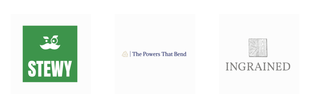
What’s the color of stew? In a word: unattractive. That would not look good for Stewy. But the food is great! It is healthy and made with fresh, organic ingredients. So let’s emphasize the fresh and organic side with a bright green.
The Powers That Bend does not want the typical colors people connect with yoga: warm tones like pastel pink, orange and purple. This business wants to stand out, so we choose a cool blue with a contrasting color for the icon.
For Ingrained the obvious color would be a light brown, right? The color of wood. It’s literal and that fits the design choices we made so far. But your typical wood is quite bright, so we need a darker tone to create contrast with the bright background.
7. Download and save all your logo versions
When your logo development is finished, you hit download. And you get more than just your logo. Because logos can be used in many places. In our Logo Creator we want to make sure you always have the right version, wherever you need it.
To get going straight away, we can build a website based on your logo development. All your choices for color, style and industry will be used to build your website.
Let’s see where all those versions go.
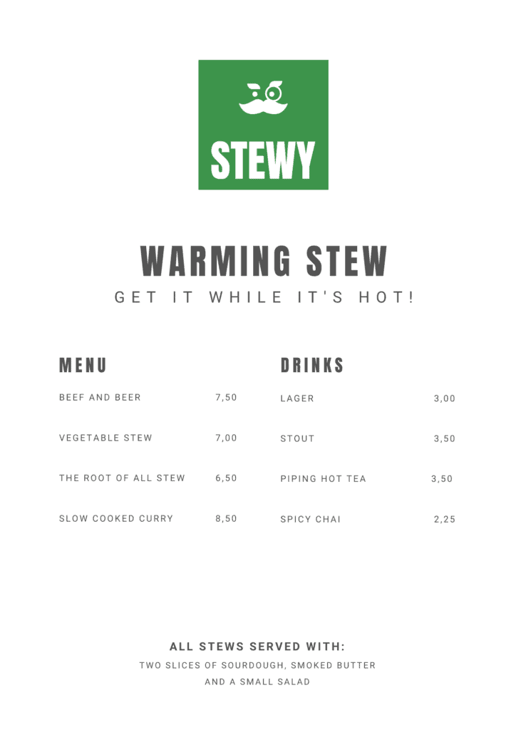
A full color version
This one stands out beautifully on a white or light background. You’ll get large and small versions of your logo.
A white version
This file makes you look good on a dark background.
An SVG-file
This is not a common file for everyone. It is very useful though. It keeps its quality if the file is scaled. So your logo doesn’t look pixelated on a large poster for an event.

A file with only your icon or initial
Perfect for small spaces or to add some branding. This file is good for your website favicon or to print on your personalized packaging materials.
So there you have it. We have shown you three logos for three different businesses.
We have gone through all the logo development steps. We made choices based on the competition and how these business owners want to position themselves.
Personal taste always plays into the design process. You want to be proud to display your logo everywhere. Try it out on your website, use it to create your own business card, and see what you think—you can always come back to the Logo Creator and make adjustments, or start over for free!
Click the links below to use any of these logos as a starting point for your own business logo development.
Or use the Jimdo Logo Creator to develop your own logo.


